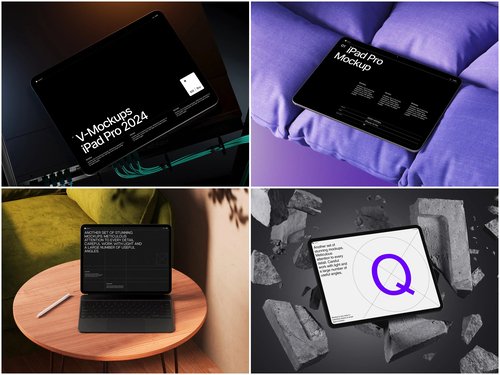
There’s a moment every designer knows — days of work on a gorgeous digital catalog, then it lands in the client’s inbox as a flat PDF. The response: “It looks… fine.” The problem isn’t your design. It’s the presentation. That’s where an iPad mockup changes everything.
Why Presentation Is Half the Work
We live in a visual economy. Clients don’t just buy products — they buy experiences. When you wrap your digital catalog inside a beautifully rendered iPad frame, you’re not showing artwork anymore — you’re telling a story about how real people will use it.
A sleek tablet placed at a natural angle on a marble desk gives your catalog weight and purpose. This psychological shift is powerful: mockup presentations dramatically increase client approval rates — not because the design changed, but because the perception of professionalism jumped several levels.
Real-World Examples: iPad Mockups in Action
The versatility of tablet mockups spans industries in surprising ways.
Fashion lookbooks are the most natural fit. A luxury brand’s seasonal collection gains instant credibility when the lookbook appears on a tablet at a café table — the viewer imagines flipping through it over a morning espresso.
E-commerce product catalogs shine in pitch meetings. A retail buyer who sees a catalog inside a realistic tablet frame immediately grasps how customers will experience it on their own devices.
Restaurant digital menus became a major use case after the global shift to tablet-based ordering. Hospitality clients visualize the guest experience without imagination required.
Real estate agencies use iPad mockups to make property guides feel premium; interior designers use them to transform mood boards into polished deliverables.
What to Look for in a Quality Mockup
Not all mockups are equal. A low-resolution, poorly lit frame can actually hurt your presentation. When choosing one for your next project, prioritize:
- Ultra-realistic rendering — accurate screen reflections, edge highlights, and natural shadows that respond correctly to the scene’s light source
- Multiple angles and perspectives — overhead flat lays for layout-heavy catalogs, isometric views for editorial work, hand-held compositions for lifestyle contexts
- Organized layered files — smart objects that let you drop your design in within minutes, without wrestling with cryptic layer structures
iPad Mockups on ls.graphics: Built for Designers Who Notice Details
When it comes to professional-grade resources, ls.graphics has earned a strong reputation. Their iPad mockup collections genuinely stand apart from the generic freebies scattered across the web.
The rendering quality is immediately noticeable. Every detail — the subtle reflective sheen on glass, precise bezels, ambient shadow beneath the device — is handled with obsessive accuracy, making clients ask whether you photographed an actual device.
File organization is equally thoughtful. Layers are clearly named and logically grouped, so dropping your design into a smart object takes minutes.
Mockups span many angles — flat overhead lays, editorial tilts, deep perspective shots, and hand-held compositions that bring human warmth to digital products. Color styles across silver, black, and gold finishes cover any brand direction. Compositions lean into stylish minimalism — clean surfaces, generous negative space — keeping your design front and center. Everything is very easy to use, even under deadline pressure.
Conclusion
The gap between a design that gets approved and one that gets forgotten often comes down to presentation. An iPad mockup gives your digital catalogs and lookbooks the real-world context they need to resonate.
Whether you’re a freelancer pitching a fashion brand or an agency presenting an e-commerce catalog, the right mockup elevates your work without changing a single pixel. Resources like those at ls.graphics make that level of polish genuinely accessible — for designers who know that how you present is just as important as what you present.


